Hotline:
(+84) 898 898 688The Common Interior Design Faults Were Concluded By Experts
Each has a different interior design style, but common mistakes are almost identical. What are they and how can they be modified?
You can read more information at Vietnam Real Estate Nice House
The following are common errors in interior design that are synthesized by professional interior designers.
Nice house too … not nice
You think that beautiful interior design just imitates the design of the beautiful models, hit after buying a house, you poured a lot of money to buy tables and chairs, lamps, curtains … look Just like in the sample house and put them in the right place. However, what you do not know is that the house at the moment looks so neat and beautiful but has no color to say. It is your home, it is extremely lacking in character.
Break the “beautiful” standards with personal touches, such as the vintage-style home with the owner’s ornaments.
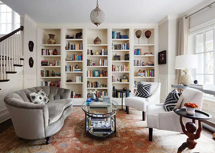
Give your home a sense of independence
Small interior design for small area
In the bathroom, there is a contrast that you try to design a small sink, the smaller the look backspace, moreover the area of use is not much. To improve this, the bathroom model below has been color-coded in a monochrome palette and covers a wide area, touching the bathroom to maximize the magnifying effect. Now, the room has both high function and look more spacious.
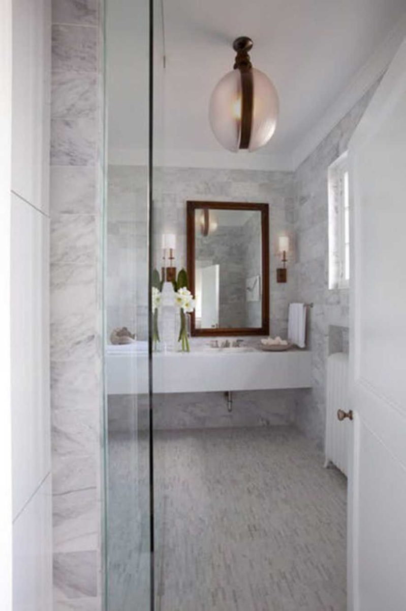

Small houses, small furniture is not necessarily right
Too many decorative details
In a multifunctional room, it is inevitable to try cramming patterns and decorations to fill the space. Landlords should be aware that each room needs space to keep an eye on the rest, otherwise it will be very confused, thereby modifying unnecessary and cumbersome decorations.
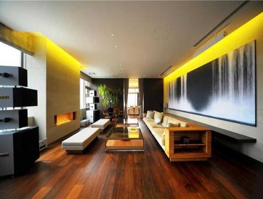
The room below has a minimalist interior that retains the character of the room as well as does not steal the attention towards art collections on the wall.
See more information at Vietnam Real Estate Market
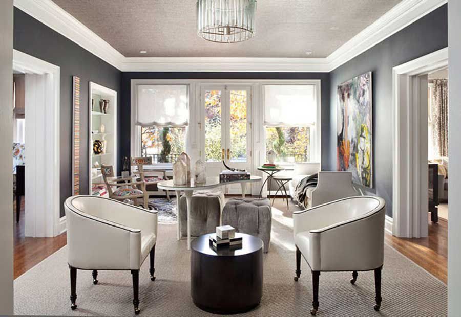

Take too much detail will make the house cluttered
There is only one interior style
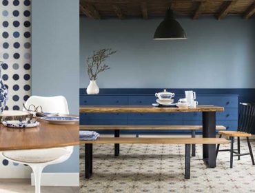
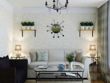
Uniformity in style does not mean the rigid pursuit of that style. A modern, modern style home does not mean that there are no bamboo baskets or classic furniture and vice versa. The beautiful house below is decorated with a combination of old wooden tables, faded leather upholstered chairs and an angular steel cabinet, along with modern chairs.
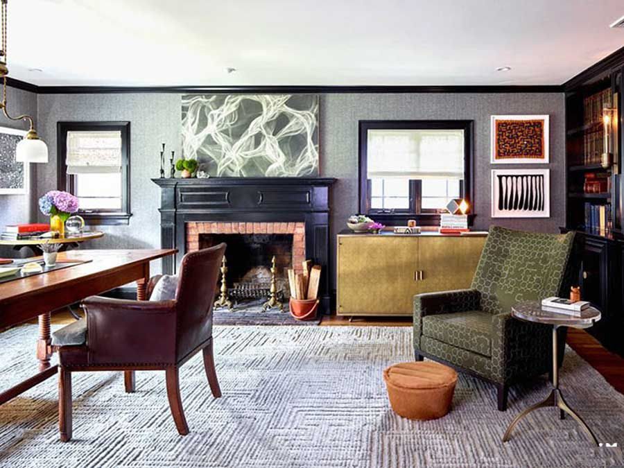

Coordination between the interior design style makes the house more special
Hanging the wrong place
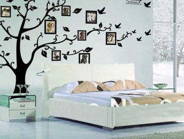
There is a common misconception is that the wall picture must be on par with the details such as doors, windows … However, the appropriate location to determine depends on the hanging area, as long as the edge of the paintings An approximate distance from the surrounding shields. A typical example of a picture in the right place can be found below.
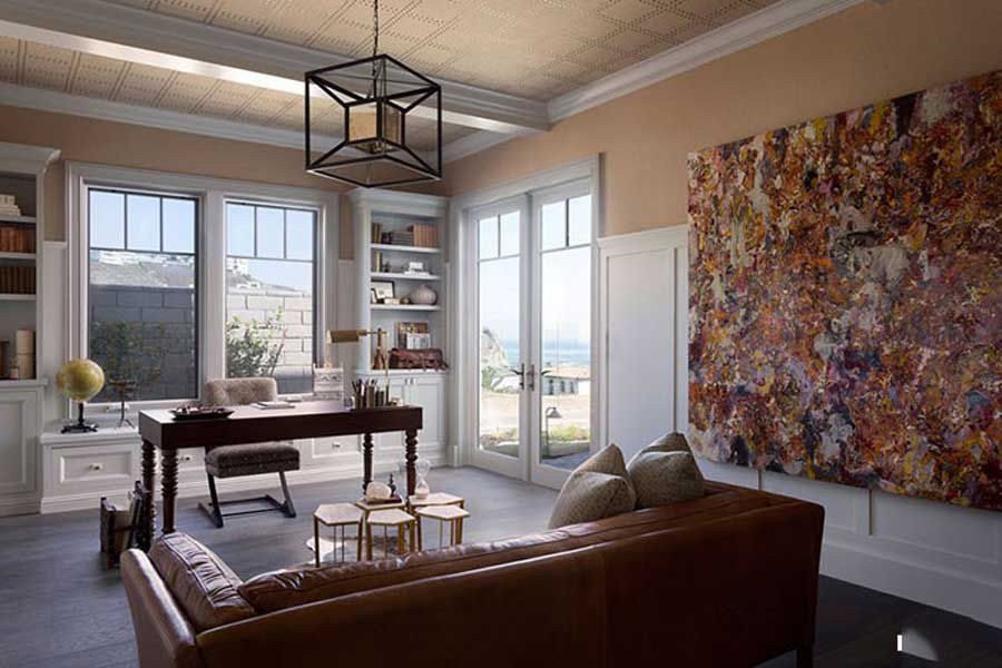

Trim picture the distance with the angles on the plane hanging pictures
The error on the note a little is actually very easy to avoid, pay attention to the interior design tips to make your home as well.
You are reading the article “The Common Interior Design Faults Were Concluded By Experts” in the section “Real Estate News” on the website: https://realestatevietnam.com.vn/
All information sharing, feedback please email to contact.vietnamrealestate@gmail.com, Hotline (+84) 898 898 688 (24/7).
Thank you!

